
API Url & Download: http://code.drewwilson.com/entry/tiptip-jquery-plugin
Test Url : http://www.uhoon.co.kr/test/454.html
툴팁에 대한 플러그인 입니다..
activation: string ("hover" by default) - jQuery method TipTip is activated with. Can be set to: "hover", "focus" or "click".
keepAlive: true of false (false by default) - When set to true the TipTip will only fadeout when you hover over the actual TipTip and then hover off of it.
maxWidth: string ("200px" by default) - CSS
edgeOffset: number (3 by default) - Distances the TipTip popup from the element with TipTip applied to it by the number of pixels specified.
defaultPosition: string ("bottom" by default) - Default orientation TipTip should show up as. You can set it to: "top", "bottom", "left" or "right".
delay: number (400 by default) - Number of milliseconds to delay before showing the TipTip popup after you
fadeIn: number (200 by default) - Speed at which the TipTip popup will fade into view.
fadeOut: number (200 by default) - Speed at which the TipTip popup will fade out of view.
attribute: string ("title" by default) - HTML attribute that TipTip should pull it's content from.
content: string (false by default) - HTML or String to use as the content for TipTip. Will overwrite content from any HTML attribute.
enter: callback function - Custom function that is run each time you
exit: callback function - Custom function that is run each time you
keepAlive: true of false (false by default) - When set to true the TipTip will only fadeout when you hover over the actual TipTip and then hover off of it.
maxWidth: string ("200px" by default) - CSS
max-width property for the TipTip element. This is a string so you can apply a percentage rule or 'auto'.edgeOffset: number (3 by default) - Distances the TipTip popup from the element with TipTip applied to it by the number of pixels specified.
defaultPosition: string ("bottom" by default) - Default orientation TipTip should show up as. You can set it to: "top", "bottom", "left" or "right".
delay: number (400 by default) - Number of milliseconds to delay before showing the TipTip popup after you
mouseover an element with TipTip applied to it.fadeIn: number (200 by default) - Speed at which the TipTip popup will fade into view.
fadeOut: number (200 by default) - Speed at which the TipTip popup will fade out of view.
attribute: string ("title" by default) - HTML attribute that TipTip should pull it's content from.
content: string (false by default) - HTML or String to use as the content for TipTip. Will overwrite content from any HTML attribute.
enter: callback function - Custom function that is run each time you
mouseoveran element with TipTip applied to it.exit: callback function - Custom function that is run each time you
mouseout of an element with TipTip applied to it.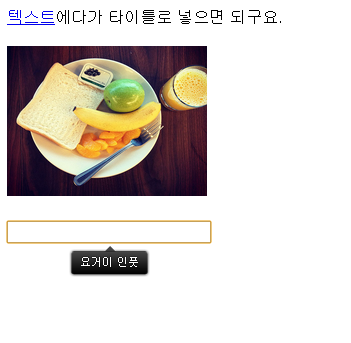
- [2013/04/15] poshytip - 툴팁 by kay (11805)
 Tree 메뉴만들기


